
Counter Culture Coffee Packaging Refresh
Packaging Design
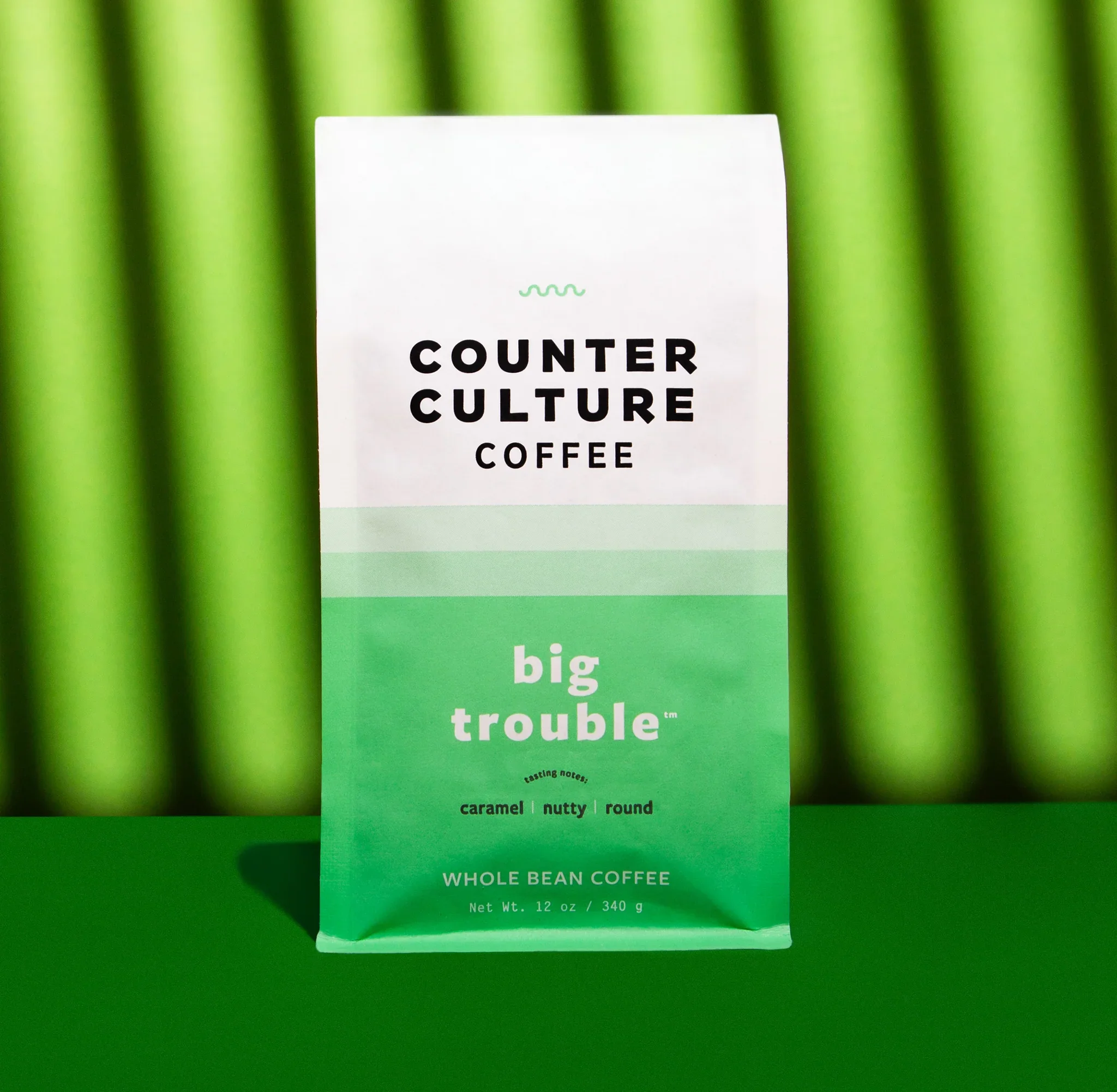
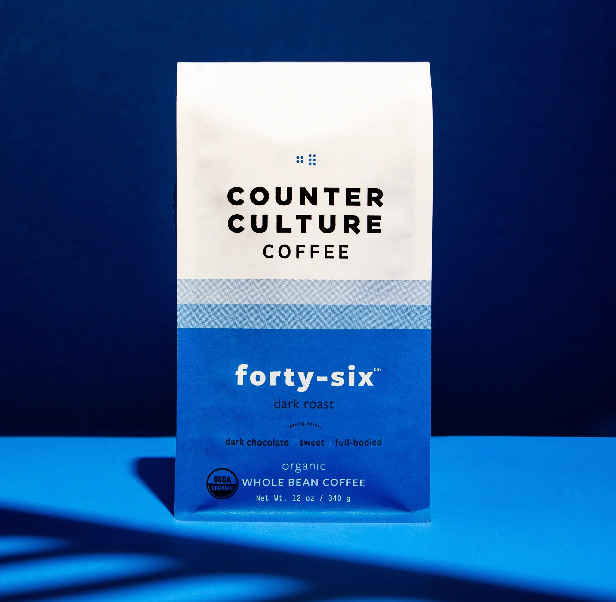
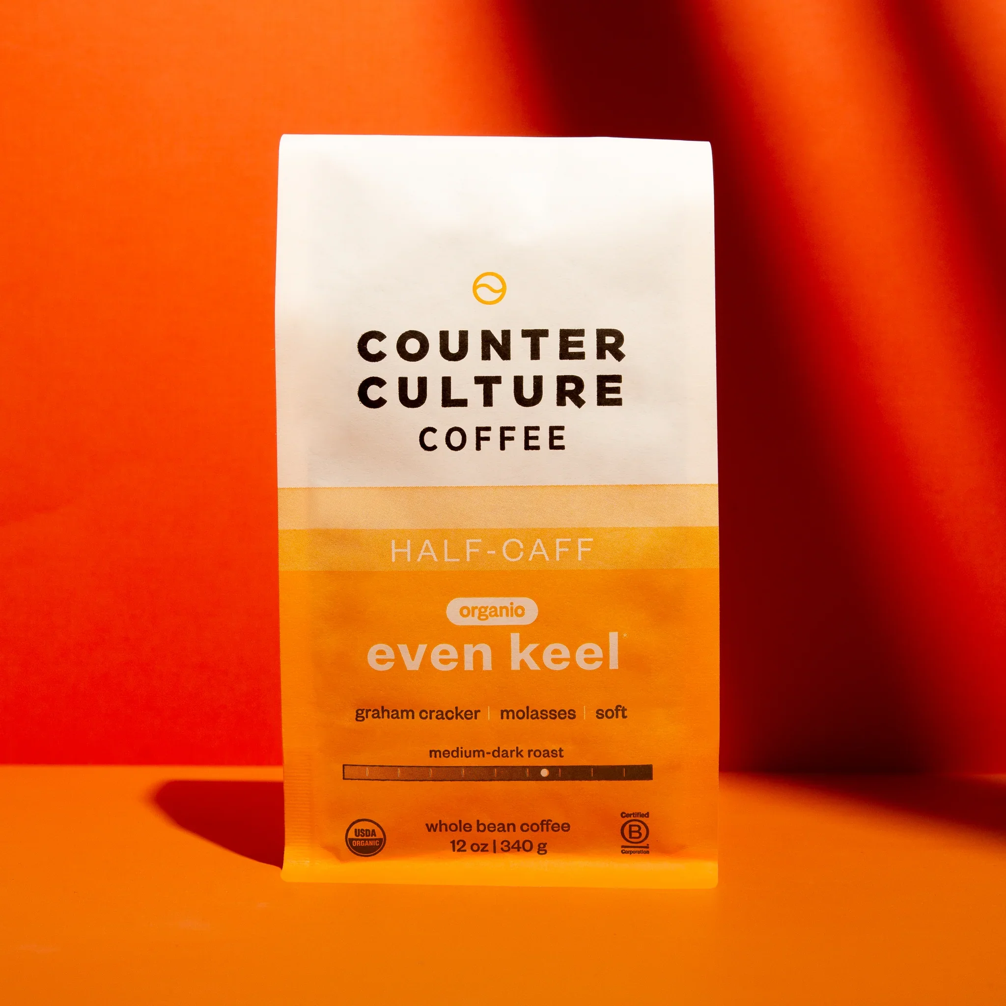
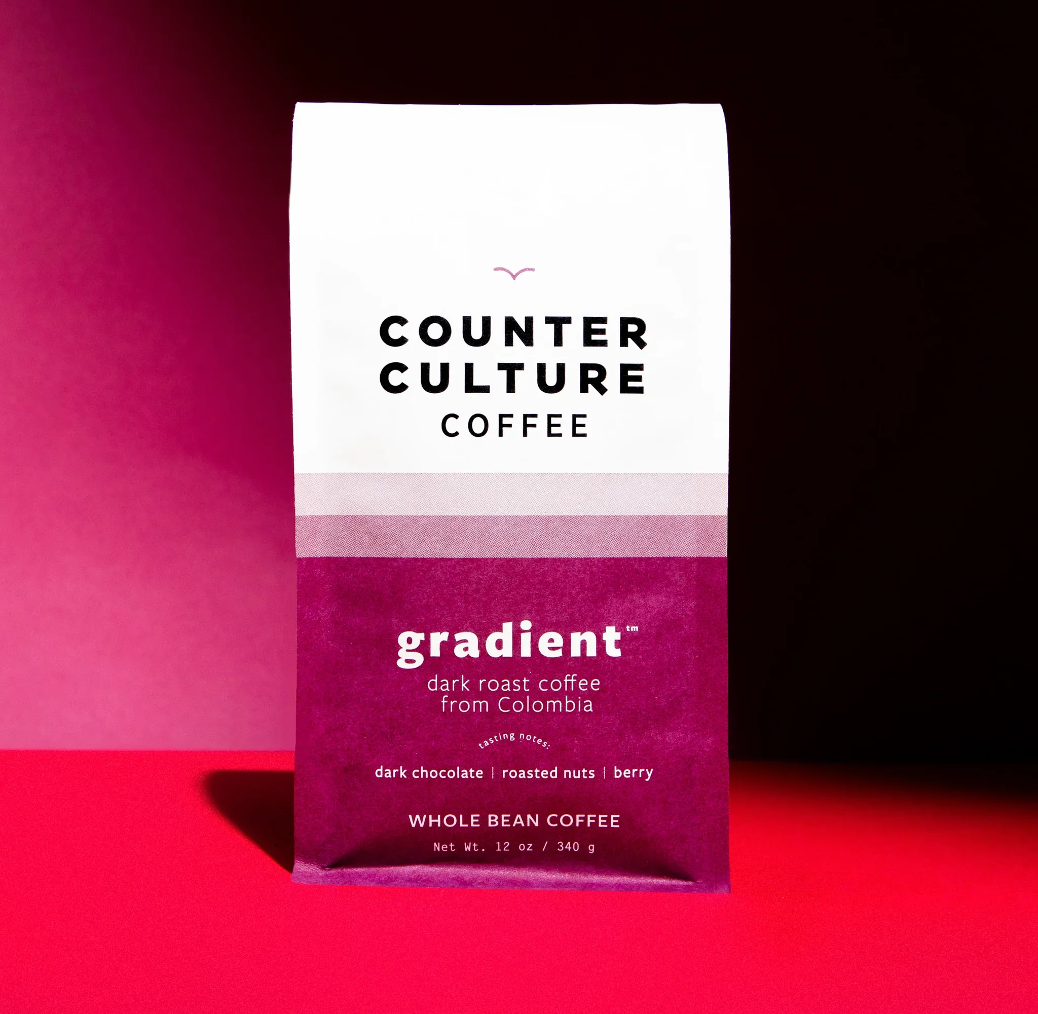
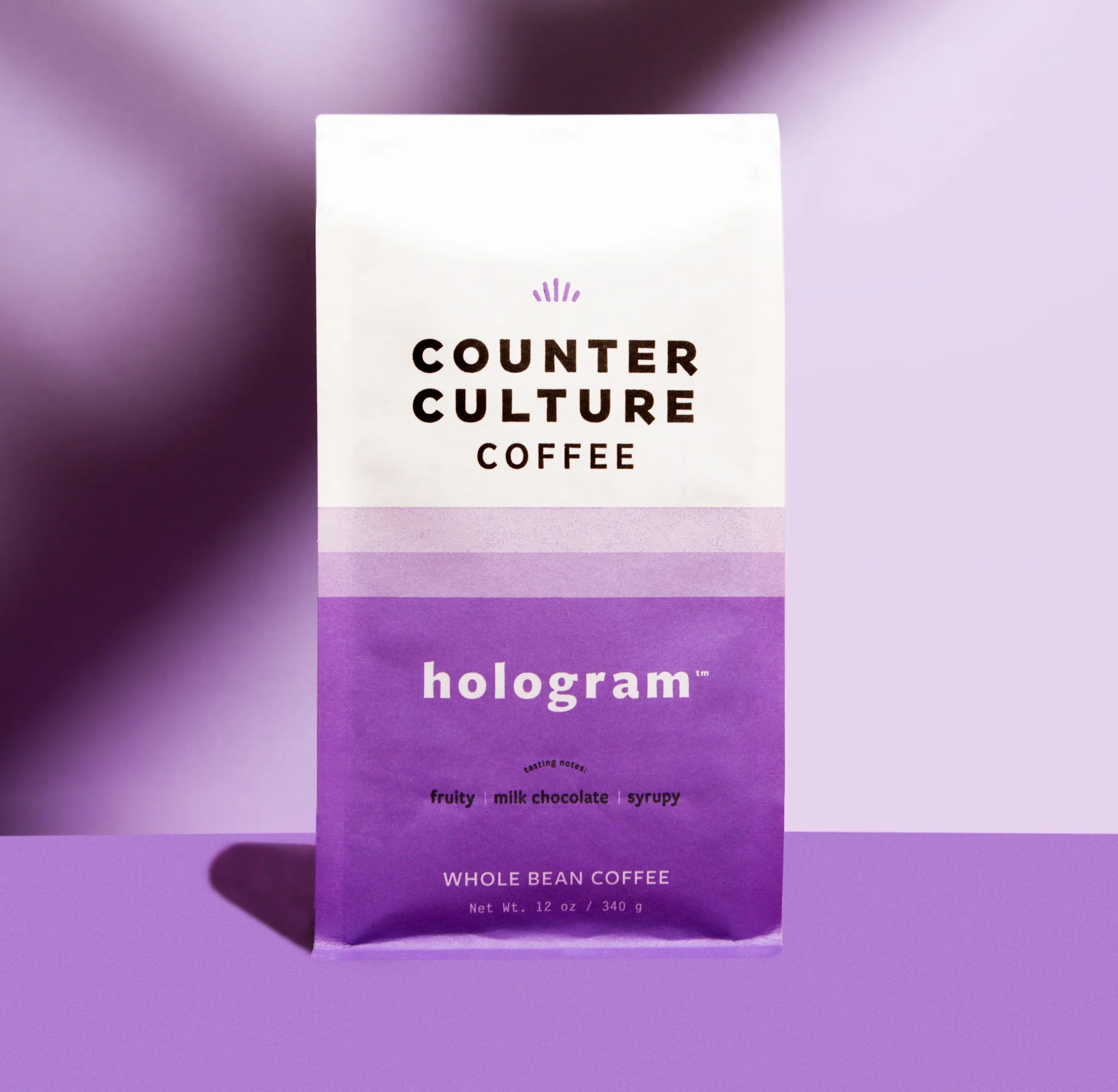
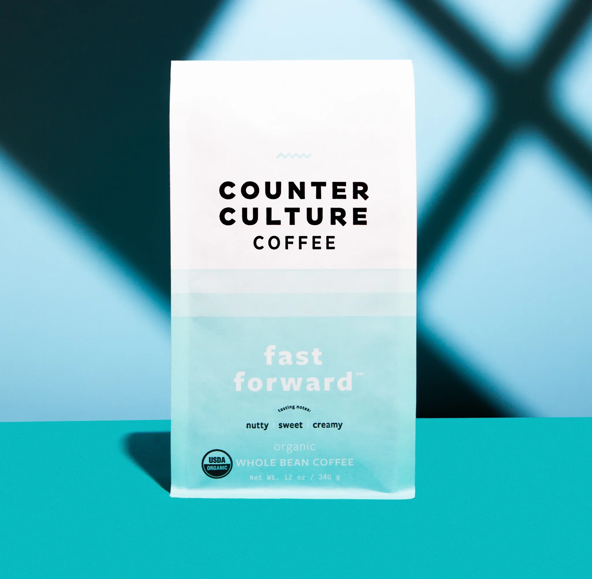
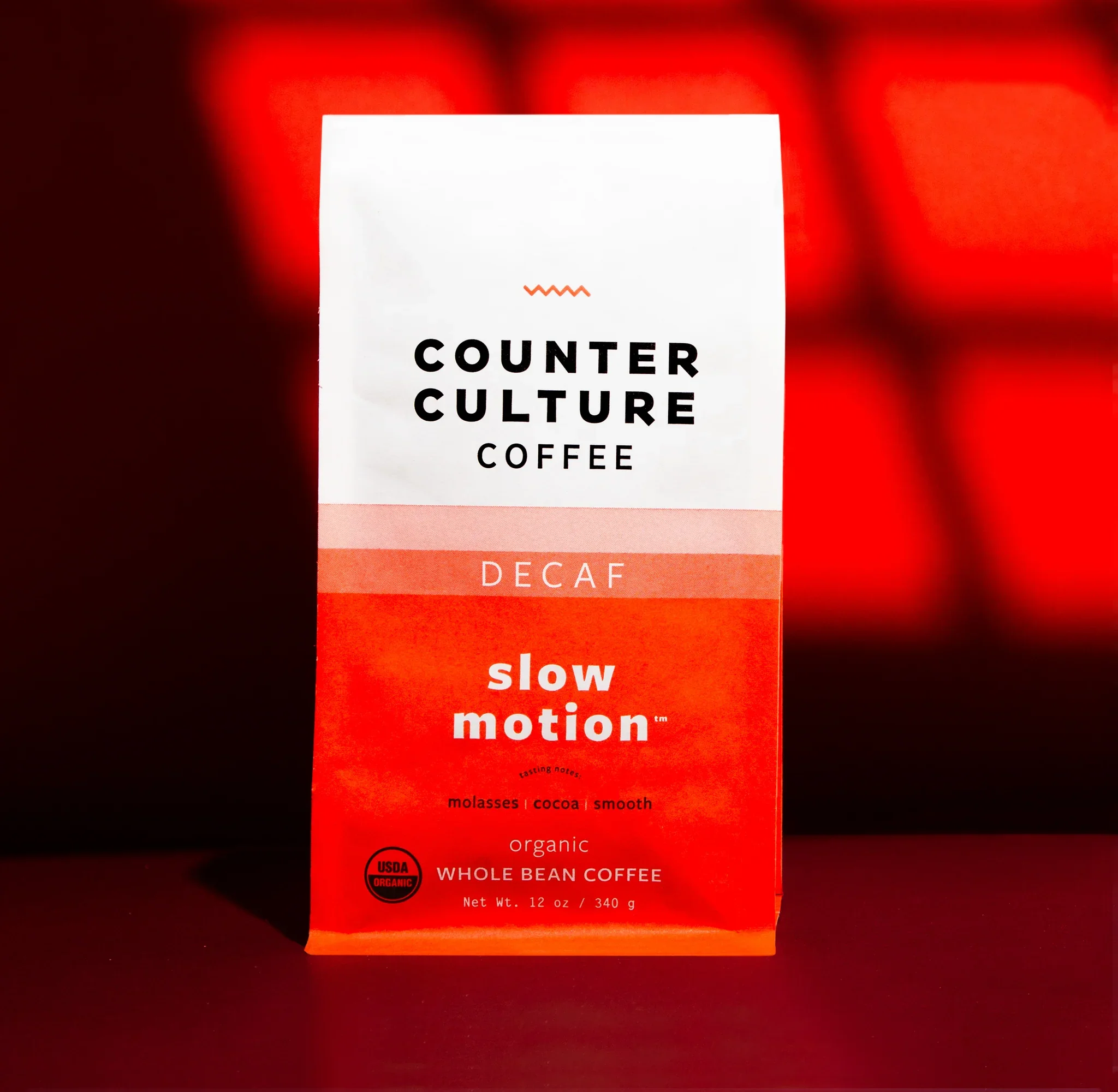
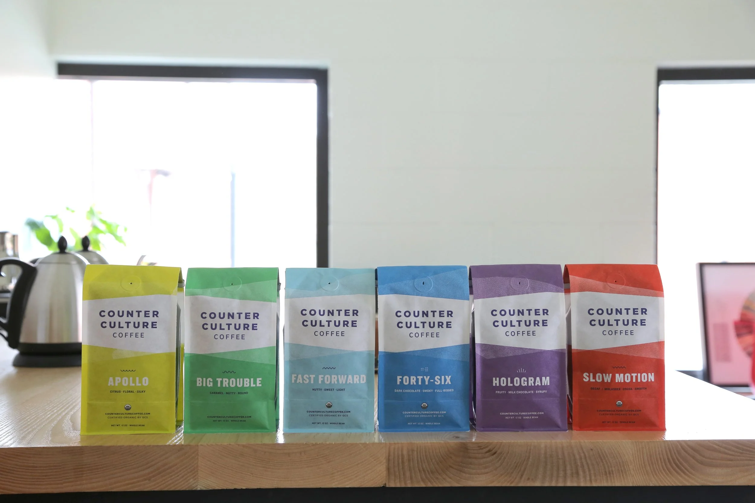
Counter Culture's packaging refresh touched every corner of the product line — core blends, single-origins, and bulk. The updated system introduced gradient color fields, expressive lowercase typography, and a cleaner white upper panel across all formats, creating a more cohesive and contemporary brand presence on shelf. Every format got its own design solution while speaking the same visual language — including the bulk bag, which solved the challenge of representing any coffee at once by putting the entire color spectrum on a single package.
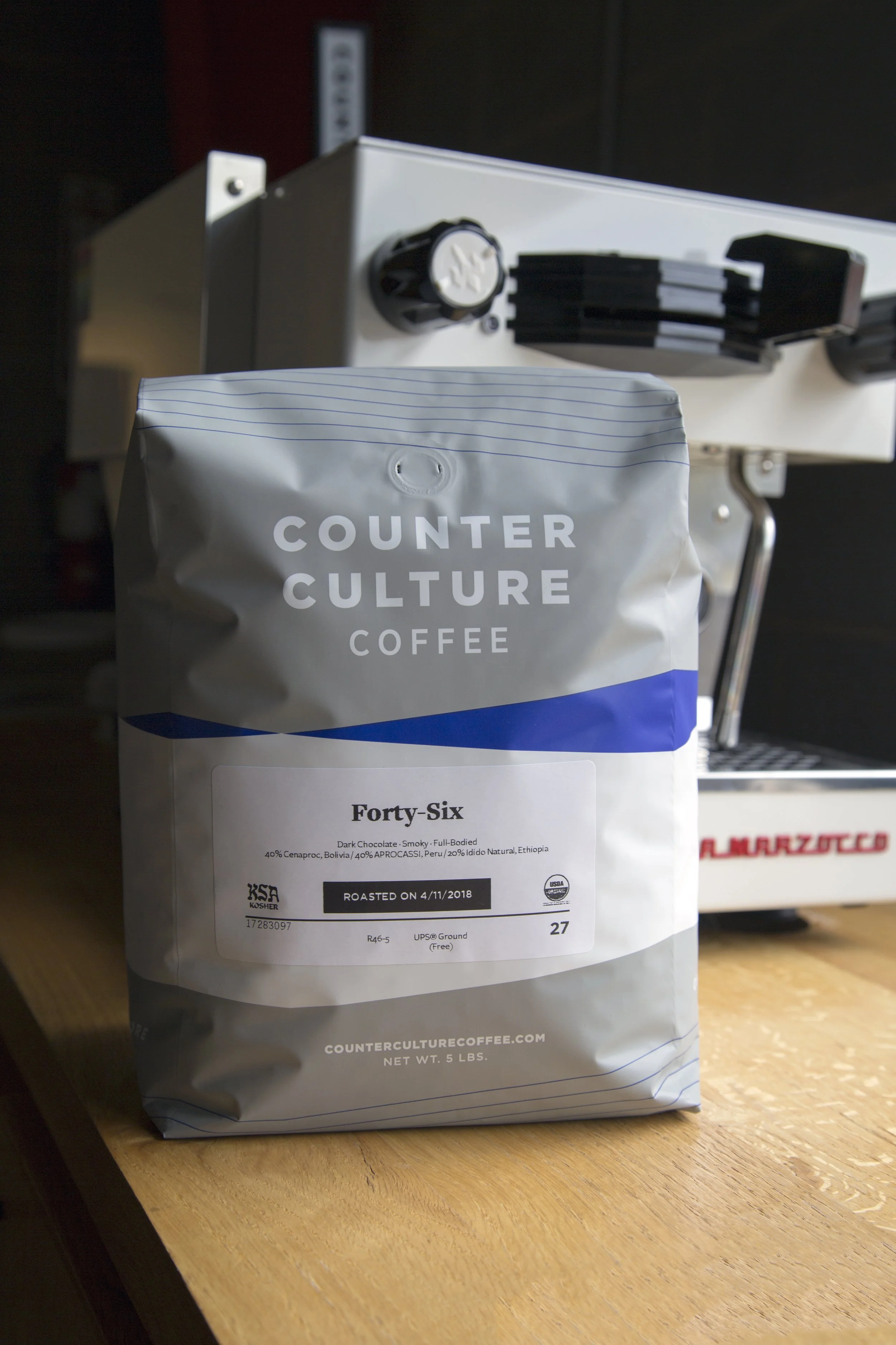
YEAR-ROUND BLEND PACKAGING
BEFORE
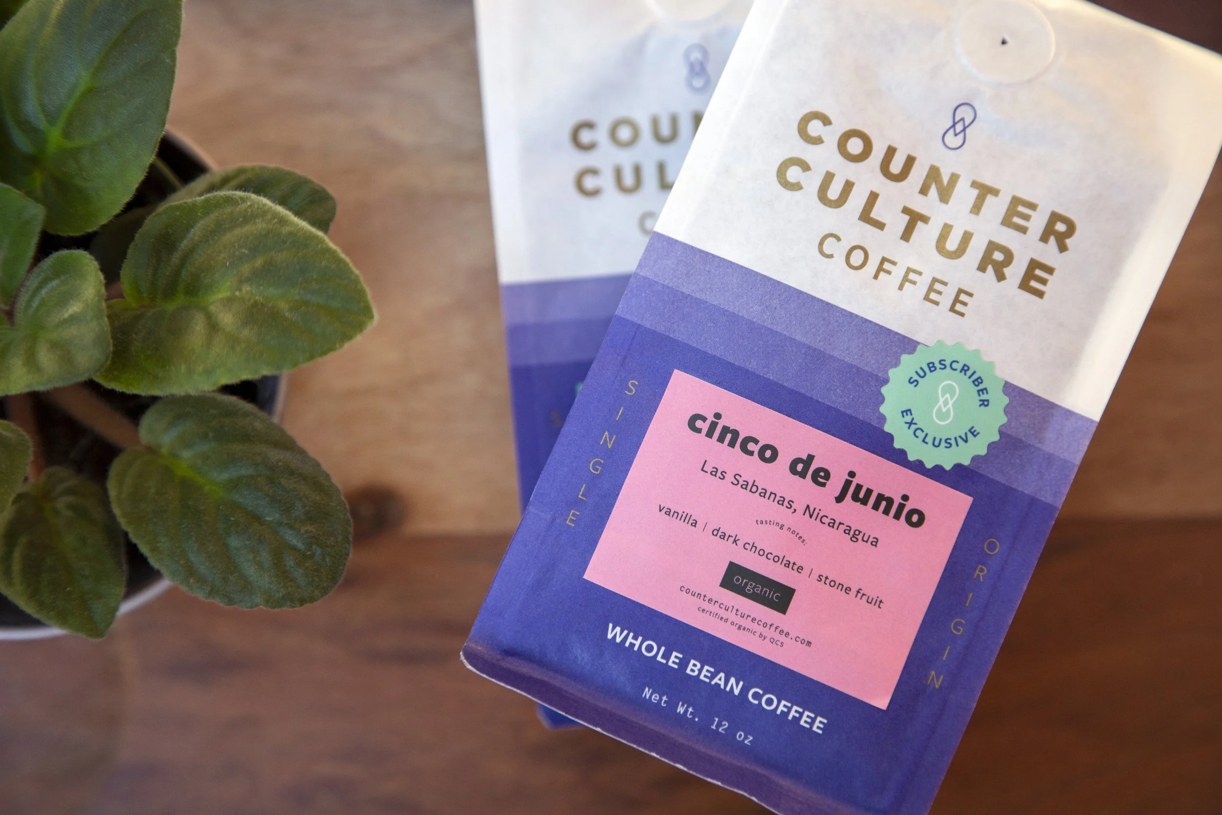
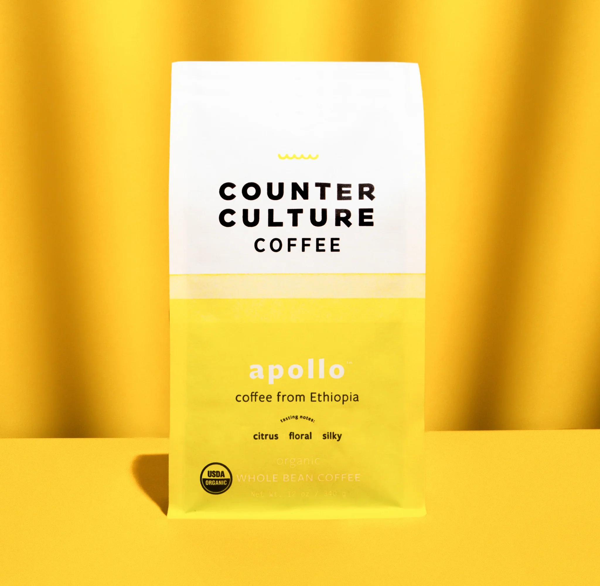
SINGLE-ORIGIN PACKAGING
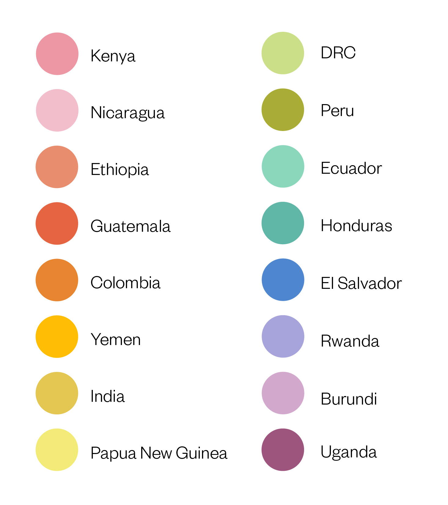
Single-origin coffees rotate constantly as harvests come and go, which means the packaging system has to work just as hard as the label design. Each origin country has its own designated color so regular customers can identify their favorite origin from across the room.
BEFORE
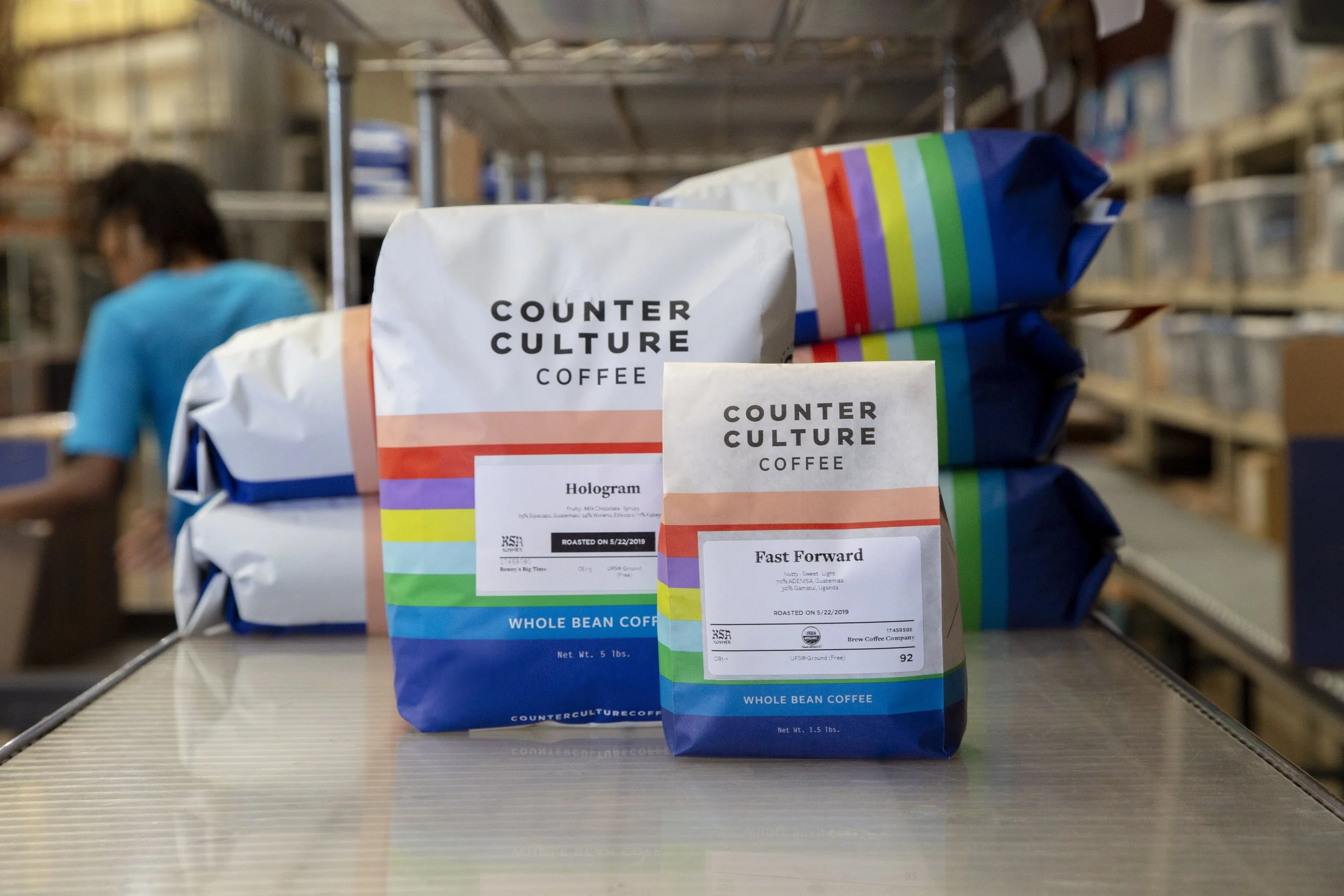
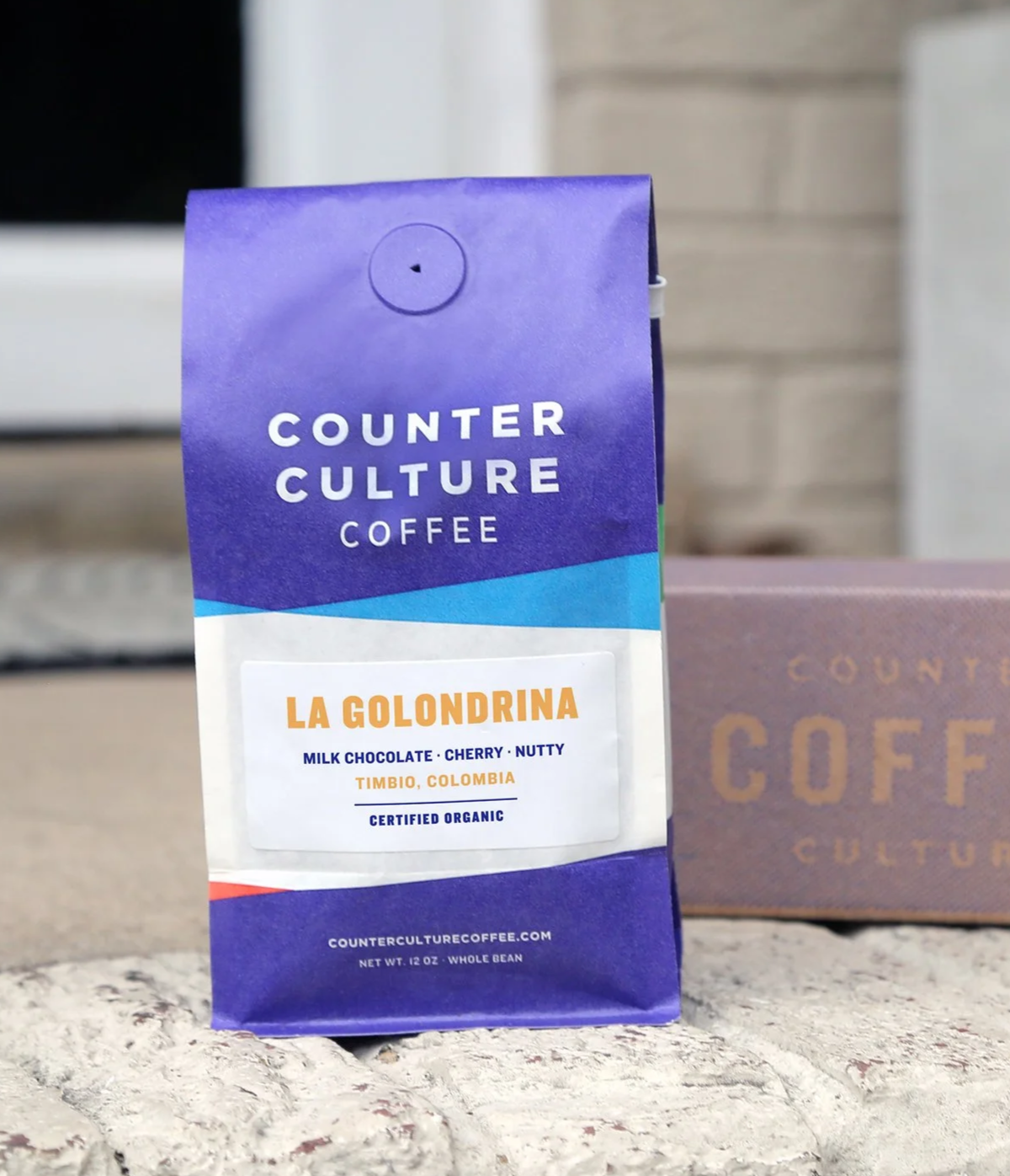
BULK PACKAGING
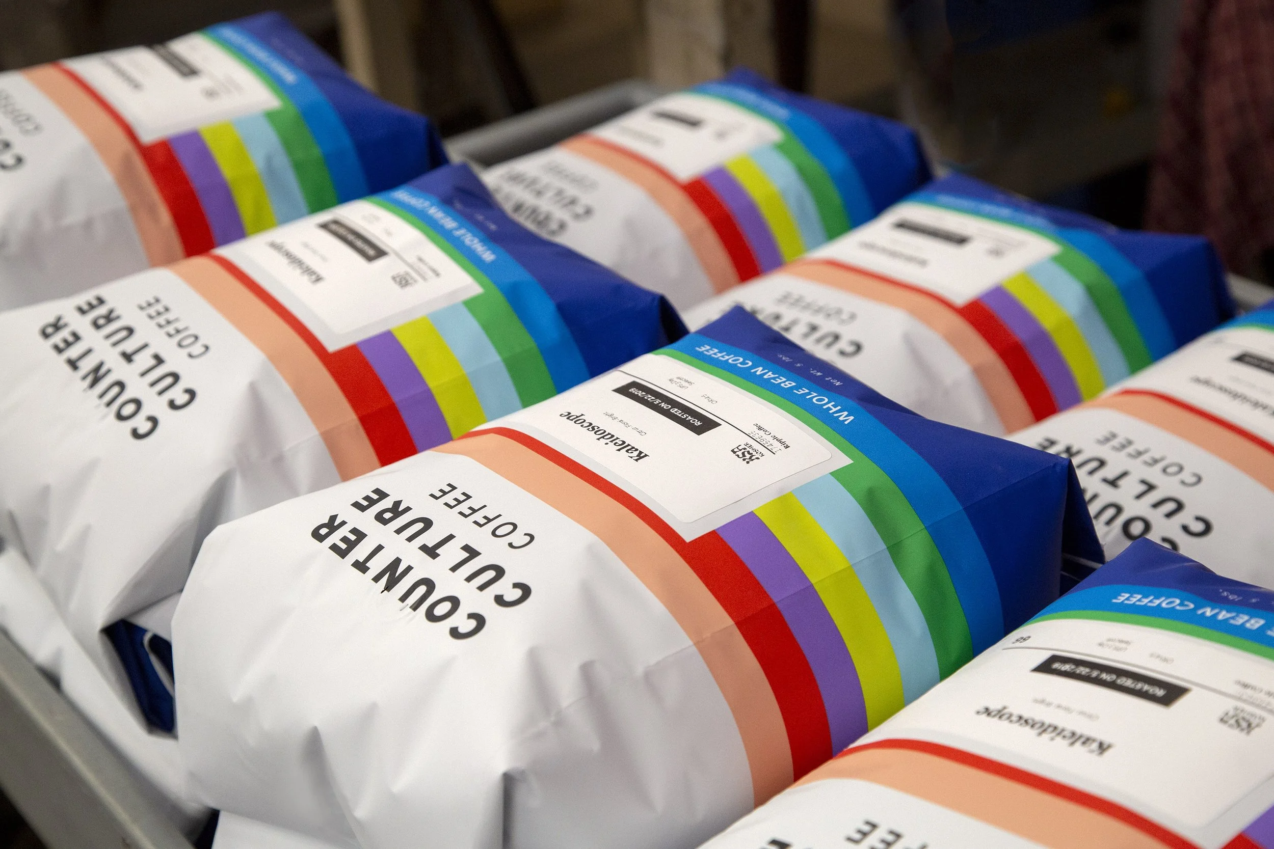

The bulk packaging presented a unique design challenge: a single 5lb and 1.5lb bag format that needs to represent any coffee in the lineup. The solution was to bring the entire color system onto one bag — a full spectrum of horizontal stripes representing every blend, and single origin blue to ground it all.
BEFORE