Coffee Club Concept
Packaging Design | Brand Identity
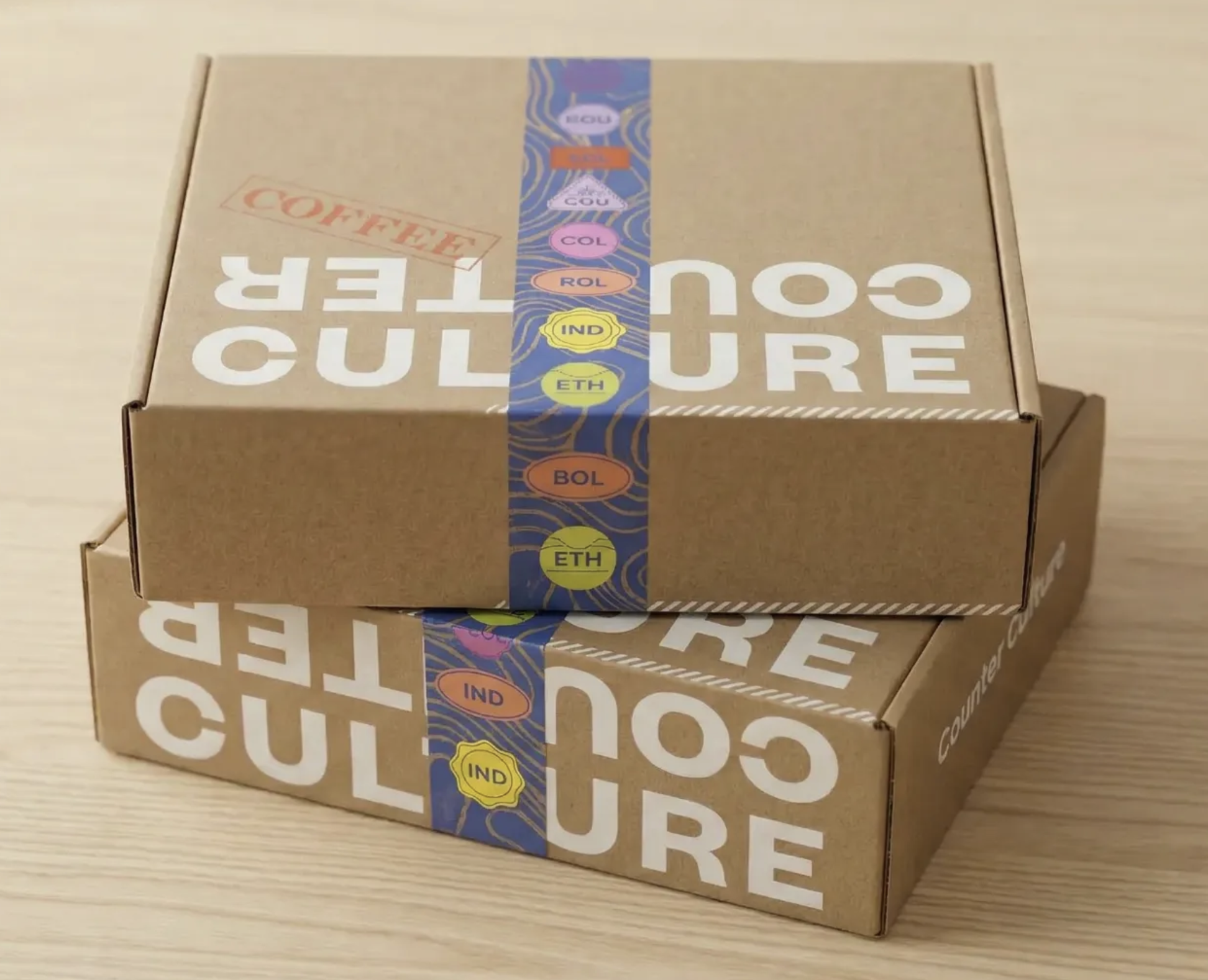
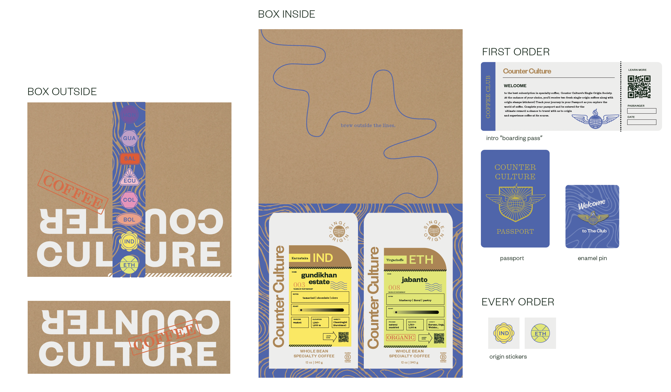
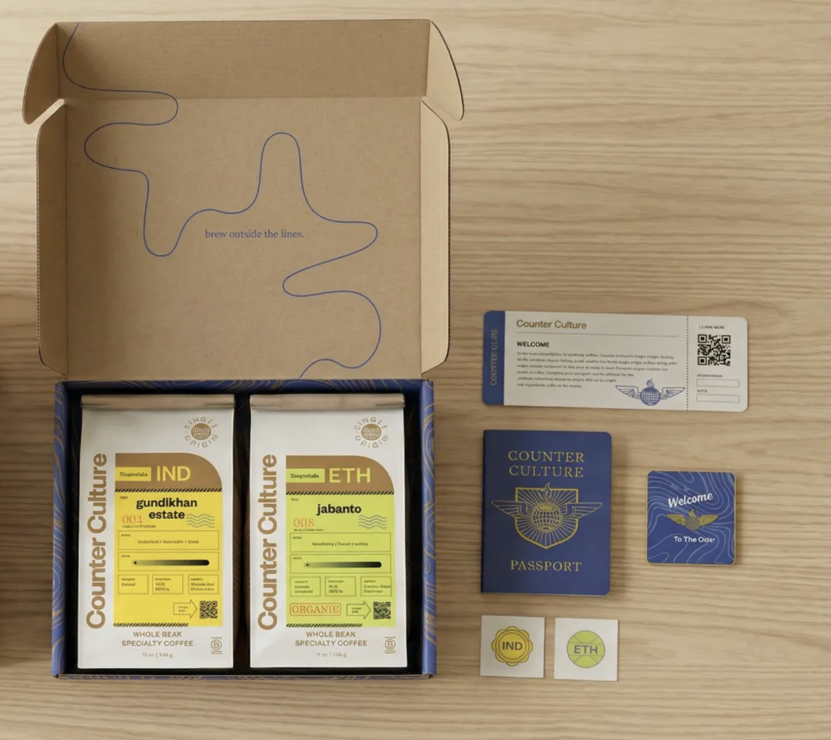
Counter Culture's flagship product is their two-bag single-origin subscription — a coffee experience delivered to your door every month. The existing packaging was functional but unremarkable, feeling more like a shipment than an invitation. This concept reimagines the subscription as a club membership, complete with a passport-style welcome booklet, collectible enamel pins, destination-coded coffee bags, and a boldly branded outer box that arrives feeling like something worth opening. The idea was to turn a transactional product into a ritual — something subscribers look forward to, talk about, and feel like they genuinely belong to.

CURRENT 2-BAG SINGLE ORIGIN SUBSCRIPTION
PROPOSED NEW DESIGN